


B2B Match
Rebranding
A Brazilian ecosystem focused on business generation and applicable knowledge for CEOs and C-level executives.
A unique platform for connections, business, and experiences, it stands apart from anything else in the market. Knowledge is essential for everyone, including top business leaders.
We were tasked with completely redesigning the brand's new identity to embody the concept of connecting people.


Concept
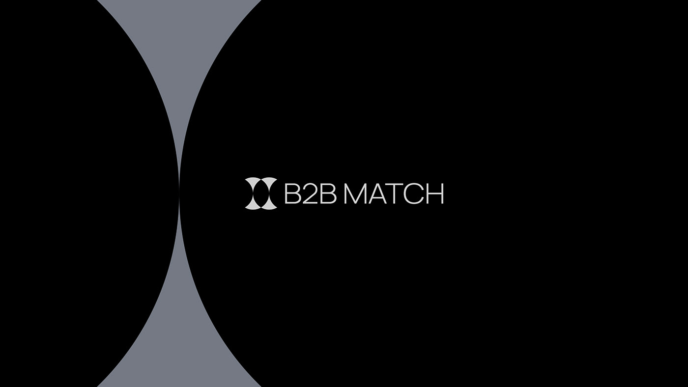
Our symbol features symmetrical crescent shapes that form a circle around a central empty space, symbolizing the elegant and harmonious union of leaders, ideas, and companies.
This central gap represents the heart of the brand, a crucial space where partnerships and opportunities thrive.

Challenge
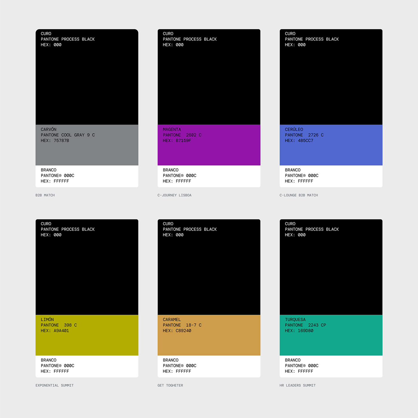
The brand's major challenge was to establish a hierarchy of identities for the various events and experiences that B2B Match offers.
To address this, we chose to create a modular visual system, where the main identity is monochromatic and specific colors distinguish each event or experience, thereby creating a cohesive visual unity.

Solution
Besides the color system, it was essential to maintain a simple, applicable, and functional identity. For this, we used two graphics derived from the symbol, named 'Vela' and 'Cálice'. These two will guide the entire visual language.


A project by Duck Design Studio for B2B Match
Team
Vinícius Germano Müller (Designer)
Gabriel Sauer (UX Researcher and Designer)
Eduardo Matos (Designer and Webflow Dev.)
Emanuel Peres (Motion)


